Protected Case Study
Please enter the password to view this case study.
2021 was a year marked by feelings of uncertainty that would continue to ebb and flow as the year progressed. It had been 12 months since the first confirmed COVID case and a few green shoots of optimism were beginning to grow across the world. We now had a year's worth of learnings about the virus, and the WHO disseminated new guidelines every week. Vaccines were starting to roll out slowly, and travel restrictions were beginning to ease as more and more communities were figuring out how to continue operating in the "new normal." However, the natural feeling of optimism would be short-lived as COVID variants such as Alpha, Beta, Delta, and Omicron (among others) quickly emerged and spread from country to country. Travel restrictions and requirements would be commonplace and fluctuate based on local and federal mandates. It became apparent for the travel industry to continue to invest in product offerings that would cater to the notion of the traveling nomad because that would become the trend for the foreseeable future as the world learned to live with COVID.
.jpg)
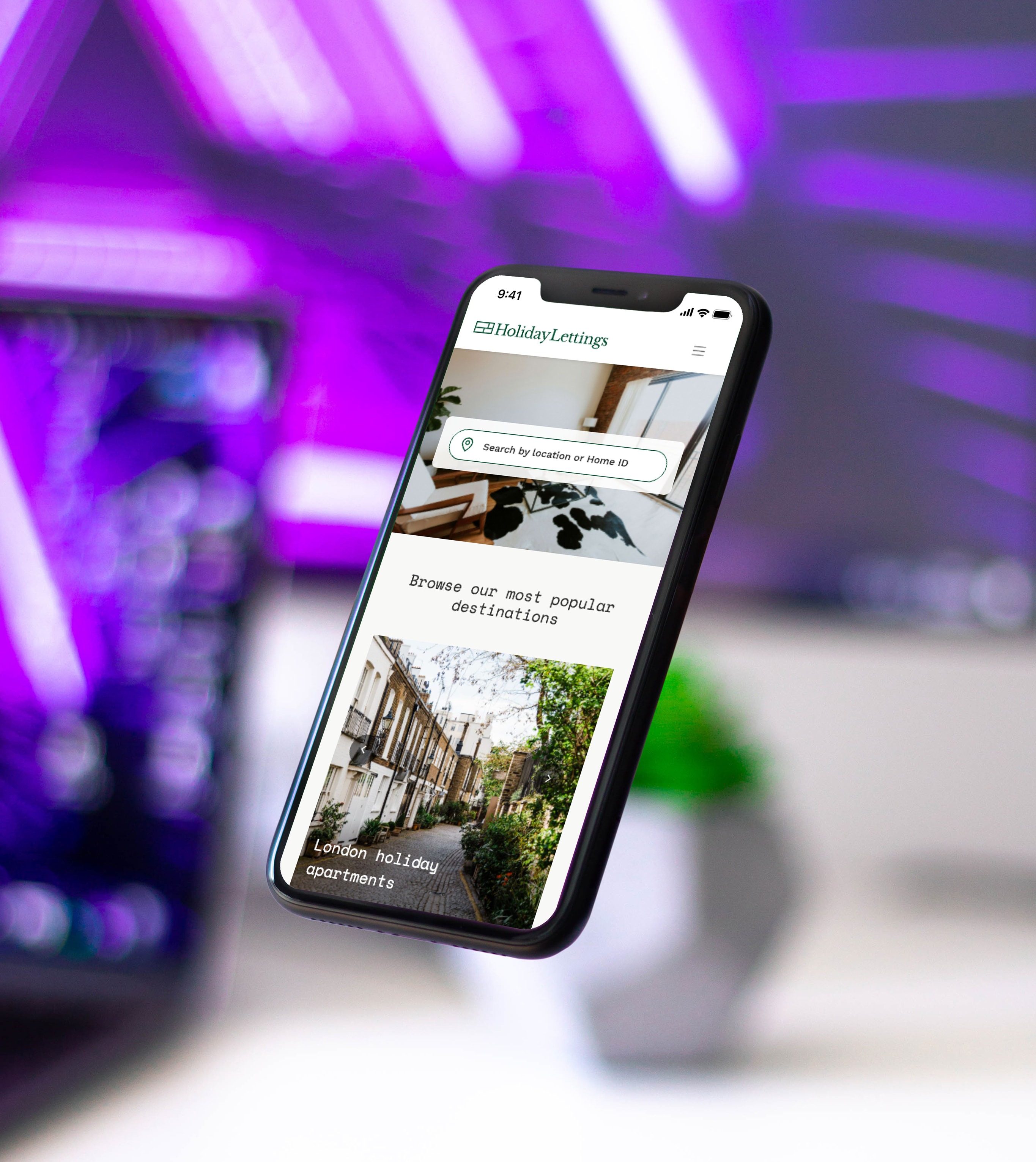
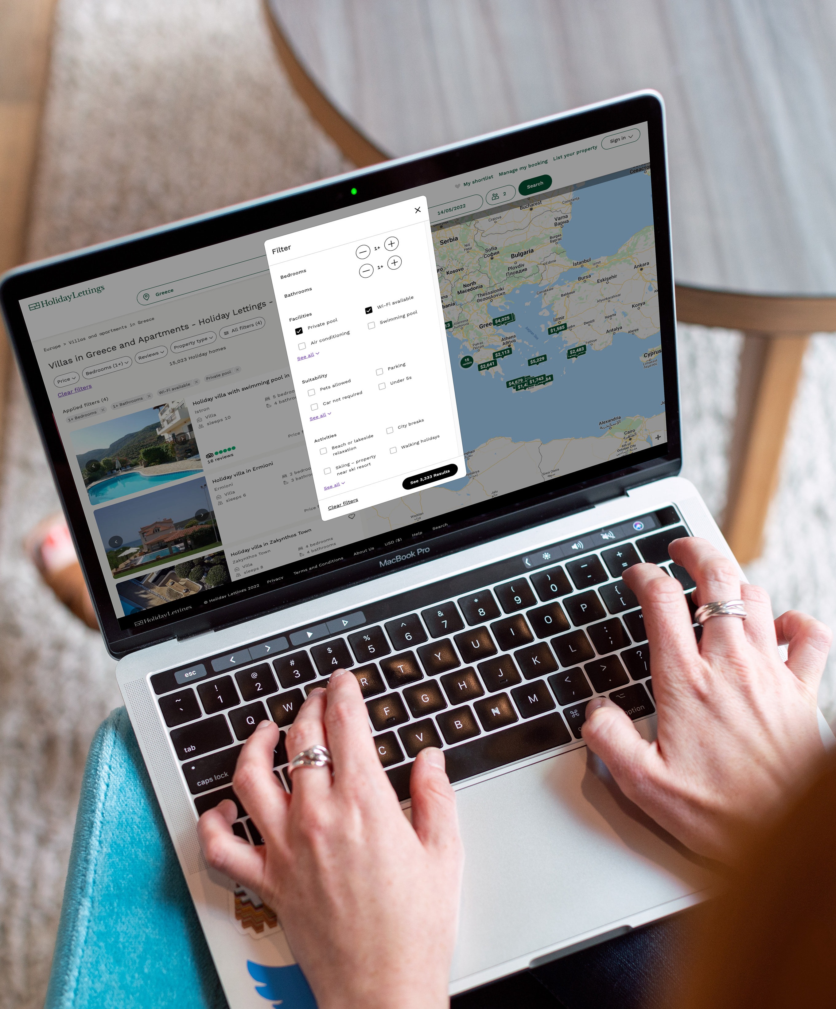
Midway into 2021, our small but mighty Tripadvisor Vacation Rentals team had recently concluded the initial phase of the Holiday Lettings Brand & UI Refresh project. That workstream intended to serve better the needs and expectations of the vacation rentals shopper in their shopping journey as the travel industry continued to rebound. The next step in the project was to evaluate the data, assess trends, and identify areas for improvement or optimization. One of those areas for improvement was the filtering UI and UX feature set, where the team noticed a drop in engagement. Filtering to a manageable consideration set is an essential shopper behavior. Past data showed that a traveler on our platform who engaged with filter features is twice as likely to make a booking. Therefore, a dip in filter engagement was a critical part of the traveler's journey to address. After a few rounds of team QA, it became clear that the issue would not be an obvious tweak or a glaring bug to fix. The most perplexing part of the issue is that the filter UI/UX was one of the few areas of the experience that did not meaningfully evolve due to its revenue sensitivity.
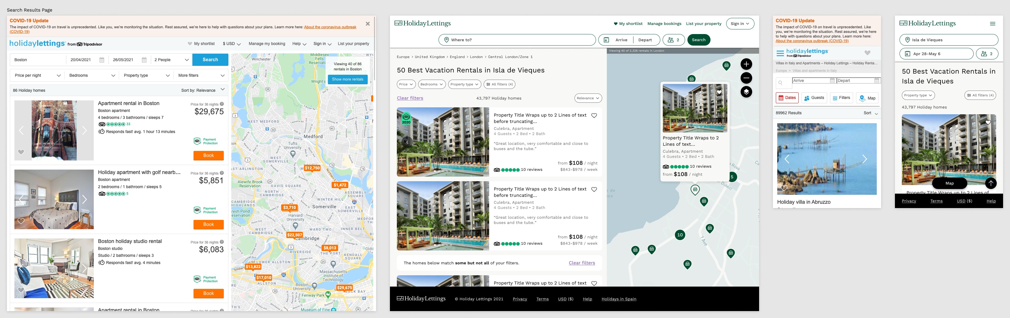
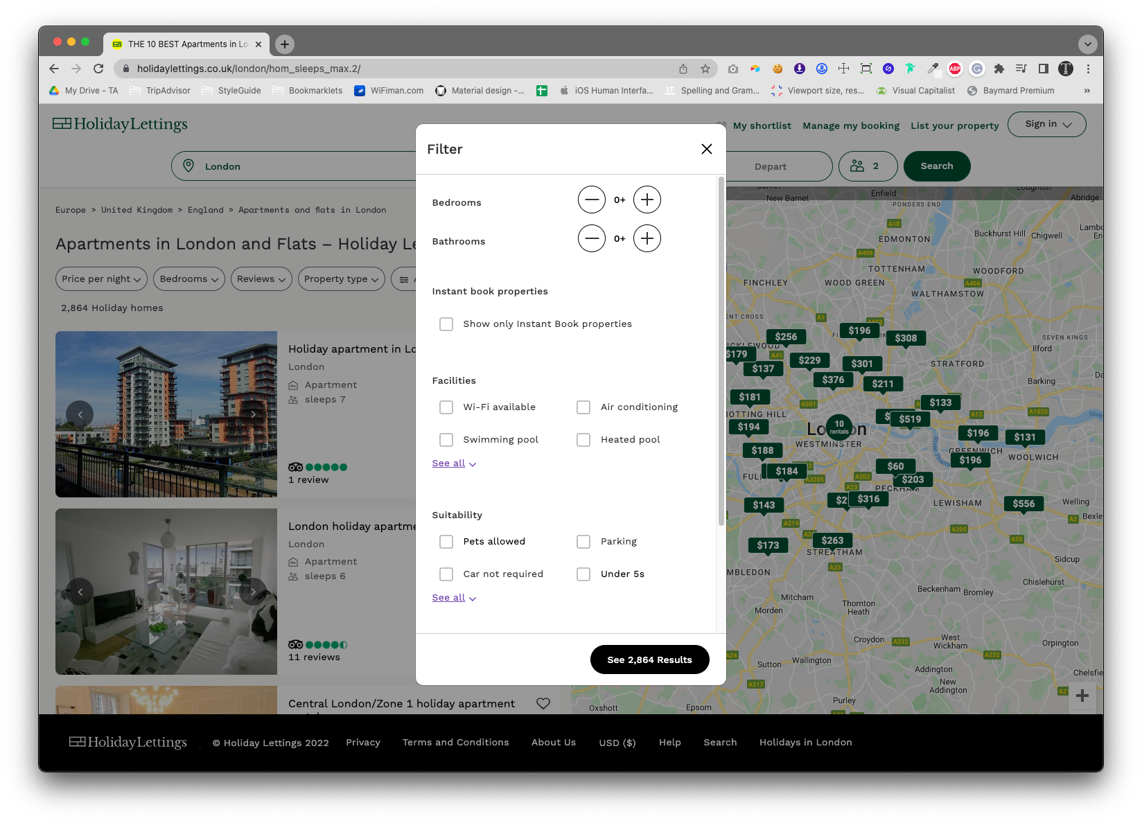
To address the drop in engagement with filters, the team needed a more profound understanding of the traveler behaviors. In addition, we needed to address the issue from a traveler-centric point of view. Therefore, I decided to partner with our internal User Experience Research Team (UXR) and draft a test plan to give us tangible insights. The primary intent of this user test was to focus on the Holiday Lettings filters experience without neglecting the other parts of the entire traveler's journey.
Together, the Director of UX Research and I created a research brief and drafted a test plan. The goal of the test plan was to craft a script for a round of unmoderated user testing that would span across the entire journey for the vacation rental shopper while zeroing in on the filtering UX. The following are a few details of the user test:
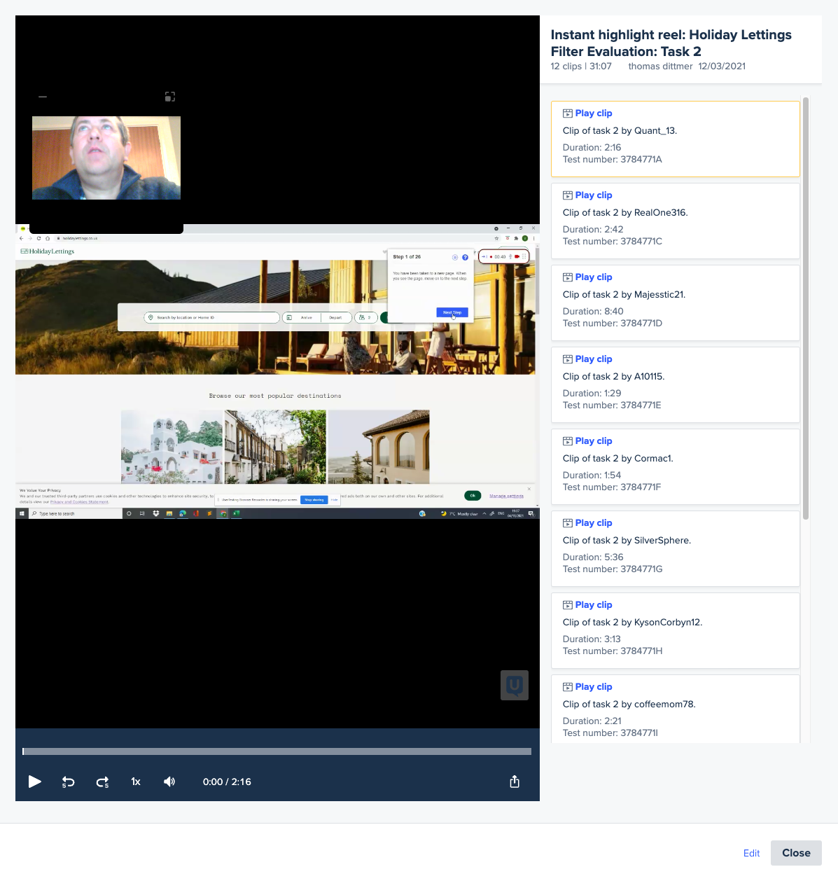
The user test revealed a treasure trove of valuable user insights for our Holiday Lettings shoppers within a few days, which was impressively fast. Of course, the timeline for receiving results might have been even quicker if our pool of participants were in the same time zone, but for this test, we needed to include participants in UK markets and US markets.
The next step was to partner with the User Research Team at Tripadvisor and the testing platform team to learn how to analyze the data and transcripts properly.
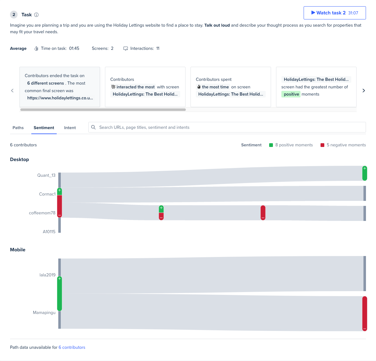
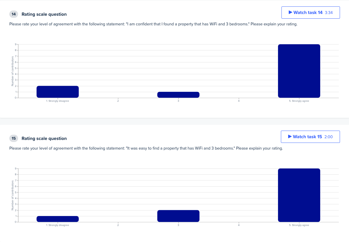
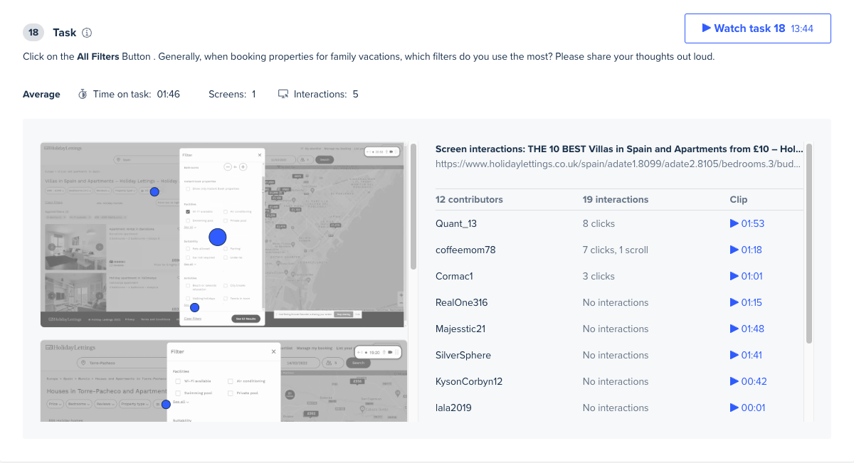
There were many outcomes from this round of user testing, both for the Tripadvisor Vacation Rentals team (specifically for the Holiday Lettings brand) and the Product Design team. It was clear from the analysis of the Holiday Lettings location of the filter UI, and the design of the filter UI did not impede the traveler's experience. These are a few quotes taken directly from the participants
It [the filter UX] was very, very simple, very, very natural. No different than any other travel site
I was never confused on where to go or how to complete that task
It's [the filter UI] where I would expect it to be
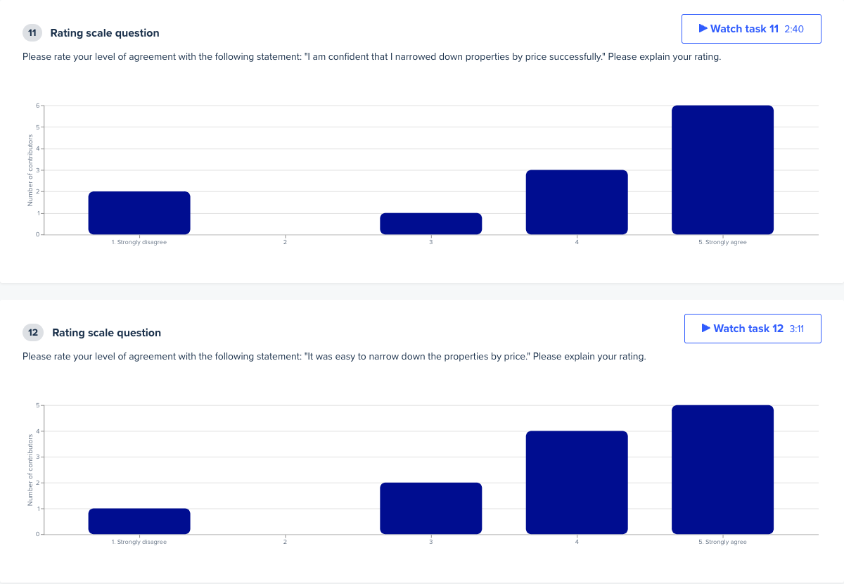
The following summarizes my findings:
These findings validated the importance of the filtering feature for the vacation rental shopper. They also gave us confidence that the current filtering feature set was discoverable and usable in its current format. Although this test did not reveal any glaring issues with the current filter UI/UX, it uncovered a host of performance and site stability issues for about half the participants, which most likely contributed to the initial drop in engagement metrics. As a result, I kicked off an ad-hoc investigation with a few engineers to seek out the cause. In addition to the performance investigation, I suggested the following next steps for the team to explore based on my observations:
In conclusion, I found it hugely beneficial to question what we thought we knew and observe actual travelers in their element. Doing so often reveals the entire story behind the on-site data trends we see in our daily dashboards.
Aside from the UI/UX learning for Holiday Lettings, I also found it helpful to document my process to make it easily repeatable for myself and the broader Product Design group at Tripadvisor. Therefore, I transformed these notes into a step-by-step guide on conducting small-scale unmoderated user tests. This guide's principal intent was to empower the team to become more self-sufficient by simplifying how we gain empathy for the traveler with oversight from our small User Experience Research Team. The more self-reliant our Product Design Team can be, the more time is freed up for the User Experience Research team to focus on more significant initiatives.